Pages

Showing posts with label Doc Destructo. Show all posts

Thursday, November 24, 2016

34 - Not Bad

First page here


Happy Thanksgiving!!!

I was supposed to post last night but I was up late doing pre-Thanksgiving preparations and totally forgot. So today it is. 

Enjoy. 


Wednesday, November 16, 2016

33 - Duels

First post here


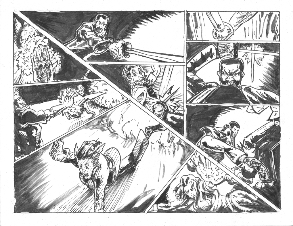
I made up a little weird layout this time. It was a bit experimental. The top right triangle is one battle and the bottom left triangle was another. I could have made the divider larger or filled in the margins with black to emphasize the pattern in retrospect. 

Otherwise I enjoy this page even if communication isn't perfect. 

Nick.


Wednesday, November 9, 2016

Wednesday, October 26, 2016

30 - Enter at your own risk...

First page here


I kinda like this page within my ability to like any of my stuff. I'm falling behind I'm going to have to get back to drawing. 

Later, 

Nick


Wednesday, October 19, 2016

29 - Behind Door Number 1?

First page here


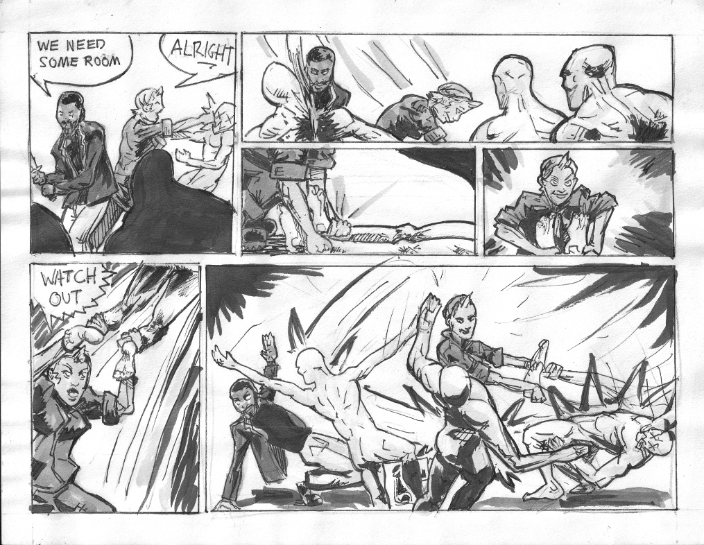
Same old same old. Had a batch of not comicking but getting back on the horse. Still have ye old buffer so publishing on time. I like the bottom left panel. I mostly see the flaws so saying I like anything at all I do is a positive step. I love Riley's lines in the last panel, much nostalgia in that. 

Another sketch. 


Next time. 

Nick. 

Wednesday, October 5, 2016

27 - Ghoul battle montage, yo!

First page here or you could just check the archive tab above which only has the ones link for now. Ah well. 


So I dropped the grays and I'm learning more about how to comic in pure black and white. Like I probably said before, the grays will come back. This is a phase. 

I'm a bit behind. My 20 hour work week of comicking crashed a bit when I got sick and so I have to rejigger things. Part of this is that my lack of sleep made me sick. So, I'm going to try a 15 hour work week and see if I can inch back up to 20 hour over time. 

Been enjoying Luke Cage TV show on Netflix. Not done yet though. Just finished Manifest. 

That's all folks.

Nick.

Wednesday, August 31, 2016

22 - Discussions

First page here

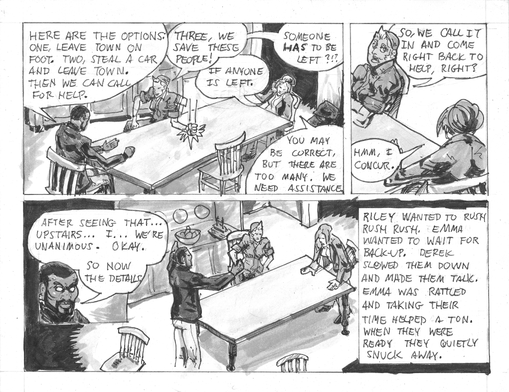
So I nearly forgot to post even though I was stuck home most of the day due to a dead battery. Go figure. No time for tons of words. 


Anyway folks. 

Until next time

Nick. 

Wednesday, August 24, 2016

21 - Clear

First page here


So I like this page. I feel like it is the first page of good storytelling I've done so far. Nothing is perfect but I'm digging it. 

I've recently been noticing that I've been randomly squishing webcomic time into my life and it is not working. I find that life and in particular my old habits of life are sneaking back up. And so I've realized I need to get more rigid about scheduling and tracking comic work time. So I'm changing my mindset. I am about to start treating this as a 20 hour a week unpaid part time job. I know this means not much to those who don't know me, but I think it may be helpful to someone trying to do what I'm doing with my webcomic if anyone ever reads it in the future and has similar ambitions. 

Thats's it for now. 

Nick. 

Wednesday, July 20, 2016

Wednesday, July 13, 2016

15 - The Ride Out

First page HERE


So normally I focus on the comic and then jot down my current comic related thoughts very quickly. This time I started typing these words slightly ahead of time. Progress! Science! The Future!

So I know I was just yapping about gray tones last week, but now I'm focusing on the inking and trying to see if I can create a well balanced page without grays. I know other people can do that, I'm just trying to do it myself. So in about 9-10 pages you'll likely see a page with no gray on it... probably.

Now that I'm drawing more often I feel like every moment is a miniscule incremental learning experience. Some observations:
  • I've settled a bit on inking first with tech pens then brushing. This is becoming my norm. Although I neaten up after with tech pen again.
  • Drawing feels in some ways like I am touching/feeling around imaginary objects with my mind. Practice is helping, but I don't have the time to practice much.
  • I do better with an hour to warm up, but I usually only have 10 minutes at most.
  • My head still isn't grappling with perspective. It is a major uphill battle. I think it will be THE battle.
  • I like to draw FAST, but it looks better if I slow down at certain points. Slowing down and being careful are very hard for me to do.
  • I like to practice doing gestural/tube people in different positions, different angles, etc. But I just draw the same familiar/safe angles/movements unless I come up with a mini-story which drives the tube person's actions. Even if it's something as simple as shopping in a supermarket. Story always helps me.
  • The cardstock paper I'm using is limiting how fine I can draw. I used some better paper for a charity piece and I can work much finer on it.
  • I saw a Wieringo Spidey pencil page and an Olivier Coipel inked Thor page live and direct. I realized I need to be much more careful and precise down to a smaller scale and with smaller lines than I currently use. They are just tight, yo. (I'm Gen X and I slang that way. That's what's up.)
Totally irrelevant to the comic. I started watching Penny Dreadful on Netflix. it's a SHOWTIME series and it's pretty good, fun in a dark way. Reminds me of the League of Extraordinary Gentleman comic a bit.

Below is an ink brush practice of Derek a.k.a. Silent Seeker, the team's resident ninja of sorts and field leader. I like how this one came out. It was fast and felt natural. 


Later, 

Nick


Wednesday, June 29, 2016

13 - Run Away, Run Away

First page here


In case you were wondering, the title of this page is indeed a Monty Python reference. 

Got a lot of wrinkling despite the use of my BIG dictionary to flatten it on the scanner. 

As usual I like some bits more than others. 

My latest micro obsession is simulating something closer to manga style gray tones using ink wash and over my very un-manga style. 

I'd say my style is not remotely settled because I have far too much still to learn, but currently is mostly influenced by Arthur Adams, 80s Frank Miller, Mike Mignola, and lately the Sickles/Caniff/Toth lineage. At least that's what I can see in the bones. Gaijin Studios alumni who I love to death are not showing any presence in my style yet. Just observing. 

So anyway the ink heavy styles I'm used to have a very different approach to gray tones, use of light and dark, line, shapes compared to most manga. I'm trying to find my place in the grays. I'm looking at Toth's Zorro, Caniff's Terry and the Pirates and various manga, most recently Full Metal Alchemist (which I am re-reading) and the original GITS and Appleseed by Masamune Shirow. Quite disparate, but fun to try and figure out what to do, especially not using computers. 

Here's another ink sketch relevant to nothing except my beautiful beautiful brush. 


Anyhoo, have a good one. 

Nick. 


Wednesday, June 22, 2016

12 - Batter Up


First page HERE


Comic is moving along fairly well. I'm about 10 pages ahead of this page and the tone is changing, getting a little darker. 

Just listened to Mike Mignola talk to some art school kids on Youtube and it was great. It was very encouraging to hear him be like - "I have no idea what I'm doing, but people seem to keep paying me." Although, that's more a paraphrase than a quote. 

I too feel like I don't know what I'm doing but I'm unpaid of course. This IS the process of improving and learning what I'm doing. Ya know? So it's all good. 

Cool tips during sketching in these Sean Murphy Vids - one, two, three

In particular the 70/30 rule in art composition. Basically every page or panel should be dominated by black or white. Whatever is 30% will naturally be the focal point and use that to storytelling advantage to direct attention. I noticed a murkiness to some of my pages and felt they didn't work very well, but didn't know why. My instincts were correct and now I know why. Excellent!

Anyway... here are some more ink practices using some characters I made up with my wife - The Stolen Binz - rock star/monster hunter/Scoobies. Inspired by The Amazing Joy Buzzards. All the drawings are way off model and style but they're just practice. I love brush no matter the results. It's magical. 

Still using pencil, paper, tech pens, brush, ink/wash, scan, scale, post method. Low tech.


Wednesday, June 15, 2016

11 - Lodged

START HERE if you're late to the comic. Otherwise...


So I like this page better than some others. I have better control of the figures and it approached how it looked in my head. I especially like the lightning in the first panel and the arm through ghoul in the second. I usually dislike my work so this is good progress for my head space. 

Most ink wash work by the American pro comic artists tends to focus on the painterly aspects and/or an accurate depiction of light. I think I want to use it more like manga tones which sometimes accurately depict light but other times use it more expressively. 

I'll be going back and forth between the two approaches, rather unconsciously over the next few pages, and more consciously later. 

Here's another ink practice piece. Nothing special. 

New time. 

Nick

Wednesday, June 8, 2016

10 - Charge


Alright plan is going alright. I only penciled a page, so this weekend is big catch up, ink 1 page, pencil/ink the next. 

Here's a free inking practice sketch. When I first got my Winsor Newton Brush.


Until next time. 

Nick

Wednesday, June 1, 2016

9 - Sneak Attack


So I created a buffer of 10 pages and So far the buffer remains. I've finished another page as I'm posting this one. 

Process wise, still the same. Sketches. 8 1/2x11 paper. Rough in blue and/or red pencils. Tightening in HB lead. Inking first with tech pens. Then come in with Winsor & Newton series 7, size 6 brush (my favorite). Brush the blacks, Then I usually go from lightest wash (watered down inks) to darkest. Scan in as a B&W image. Re-size using GIMP. Post. 

This is going to be the same process for some time. Presume it is about the same for the foreseeable future. 

Still learning. 

Enjoy. 

Nick

Sunday, August 10, 2014

7 - The Eyes of Horus


Wazzup my nonexistent fans.  Still learning and chugging along.  

This time I switched to standard comic paper I cut in half.  11x17 Bristol board.  It was a lot easier to work with generally speaking than the card stock.  It's much smoother and works better with finer details.  

Here's the pencils.  Although I did ink some borders in ink.  


My inner critic pretty much hates everything I do but I've been doing a pretty good job of shutting him up and just putting my butt in the seat and drawing.  

I didn't scan my little outliney inks as it was pretty sparse and frankly I forgot.  So the final is the inks.  But here it is again but smaller just 'cause.  


Now I tried out some more ink wash action, but I forgot which bottles were lightest, medium and dark gray.  Needless to say that screwed up my plans.  I tried to fix it as best I could with okay success.  

I do like that the roof is darker and separated from the well lit below.  I eyeballed perspective so I'm sure it's all wrong, but screw it.  It is what it is.  

Anyhoo.  Still plugging away.  

I hope anyone reading keeps plugging away at the hobbies/arts they love.  That's all we can really do.  

Nick.  

Sunday, July 27, 2014

6 - Electroshock


Final strip above was done with dip pens, brush for the large black areas, and the gray tones done via dip pen into watered down inks.  Lettering, borders and little touches done with microns.  A little PRO white paint for touch ups.  I'll discuss that further below.  

Been rescheduling how I organize my week.  Been doing more consecutive art on weekends and less during the week.  Art like life seems to be a permanent experiment.  Nothing is static.  

Here are the pencils.  I like pieces.  I like the expressions on panel 2 and 4.  I totally gave up too soon and studied too little on my electricity effects on panel 3.  It's cool, though.  Time constraints and learning on the go.  Next time I'll do more studies of just lightning prior to drawing it.  


So I forgot to scan the inks.  Sorry.  But I have some extras for those who care about my crappy technique experiments.  So I wanted to try another form of gray-toning and so I went with ink wash.  

I found Will Morris's blog and I really liked his art and he had some ink wash pieces that were inspirational.  In particular these entries...


And he was kind enough to even comment back to me his technique on the last blog.  I sorta used his technique.  I didn't quite follow instructions.  I eyeballed some things.  I dumped some of the wash and thinned out the ink once or twice.  I played around with using ink wash with brush and with dip pen to see what's up with it.  

I bought 3 airbrush jars to hold my washes from Plaza here in Nashville.  They look like this.  http://www.wonderlandmodels.com/products/badger-airbrush-jar-34oz/

But I put a I, II, III on the lids to keep track of darkest to lightest.  It holds a crap load and I should run out in the years 2050 maybe.  

Anyway here are my ink wash experiments.    


Above, the face on the right is entirely dip pen, different shades/solutions of ink wash.  I like the effect to some extent but I find it distractingly busy.  I like the invisibility of the brush.  All those little lines focus too much attention on the lines and not enough on the drawing as a whole.  

These pages were pretty warped by the wetness level of the ink washes.  You can see the shadows on the pages.  I put my "big dictionary" on the scanner for my final comic to reduce the distortions in the scanning process.  It's a giant unabridged 1967 (or is it 1963, I forget) Funk and Wagnalls dictionary which I love but rarely use.  It helped flatten things out.  

I'm getting a crapload of bleeding on my inking.  I know my skill is somewhat to blame, but I think it may be in part the card stock I'm using instead of standard Bristol board.  I'm also working small (8 1/2"x11") which doesn't help.  I'm going to have to return to microns as my primary inking tool until I work through my card stock.  

Here are some random sketches of characters that will be/are part of the comic strip.  


And that's all I got for now.  I'll try and publish next Sunday, but we'll have to see how I do.  

Audi 5000, 

Nick.  

Sunday, July 13, 2014

5 - Ghoul Fight


Next ep.  Getting a little faster.  Playing and learning.  Not much new to comment about, more an extension of what I've been learning.  Pieces I like and some a I don't.  Learning as I go does that ya know.  

Here's the pencils.  I like these better than my inks and finals, mostly.  


Here's the inks.  


Used mostly microns and brush again.  Screwed up a lot due to low visibility using my lightbox, particularly around the tiny itty bitty areas.  So next time going to lightbox for broad outlines.  Then I'll put pencils side by side with inks so I can kinda copy the details.  

Shading stage up top done with #2 pencil.  Mixed feelings about it.  But that's how it goes.  

Messing around with dip pen and I think I'll use that next time and ditch the microns except for panel borders and lettering.  

Hope you enjoy.  

Nick.  

Tuesday, July 1, 2014

4 - The Unexpected


Alright my non-existent fans, long time no see.  I'm still working the same basic method.  Started out with rough script.  Then thumbnailed a couple of layouts and ended up taking what I thought were the best elements of both and merged them.  

Here's the pencils, yo.  


8 1/2 x 11" white Cardstock Pack, acid & lignin free from The Paper Studio.  50 sheets for $5.  Did roughs colerase blue and red.  Figures got a little confusing so I used red for the ghouls to help my eyes differentiate.  Lost some patience on last panel and didn't do enough planning/underdrawing to really nail it.  Ah well.  

Inking went pretty well.  I like some bits more than others.  I liked my Derek/Silent Seeker reaction shots even though I'm not good at keeping anyone on model.  Partially because I don't create model sheets, maybe.  Partially because I'm not that good yet.  Inked w/microns (mostly 8, 5, 3) and brush.  


I'm feeling the ink then pencil shading.  I started out with an H and found it too subtle and used mostly 4B with different levels of pressure.  

I'm pretty happy with my progress although I still see all the flaws.  I'm more optimistic than I've ever been about my art even though I still criticize it.  I feel progress.  

I think the thing I really have to do is budget time better.  Its not taking me terribly long, but I'm find it hard to get to the art table.  It used to be about fear/dread of seeing how horrible I think I draw, but not any more.  It's my second character flaw, poor time management/absent minded professorishness. Also I tend to put art last on the To-Do list.  

I'm going to really try to put this out weekly.  I'm about monthly now and that's just ridiculously slow.  At this rate I'll get my first story arc out in the year 2350 AD (although I'll get to meet Duck Dodgers - bonus!).  

So hopefully I'll make that goal.  

Check ya later.  

Nick.