First page here.

In case you were wondering, the title of this page is indeed a Monty Python reference.
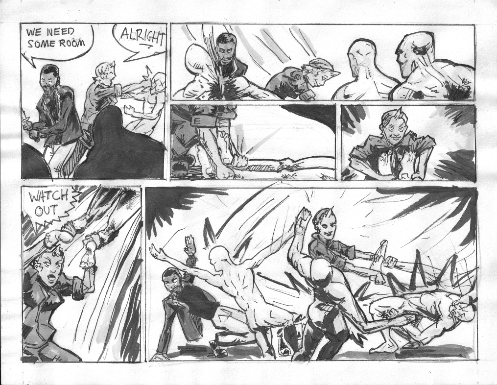
Got a lot of wrinkling despite the use of my BIG dictionary to flatten it on the scanner.
As usual I like some bits more than others.
My latest micro obsession is simulating something closer to manga style gray tones using ink wash and over my very un-manga style.
I'd say my style is not remotely settled because I have far too much still to learn, but currently is mostly influenced by Arthur Adams, 80s Frank Miller, Mike Mignola, and lately the Sickles/Caniff/Toth lineage. At least that's what I can see in the bones. Gaijin Studios alumni who I love to death are not showing any presence in my style yet. Just observing.
So anyway the ink heavy styles I'm used to have a very different approach to gray tones, use of light and dark, line, shapes compared to most manga. I'm trying to find my place in the grays. I'm looking at Toth's Zorro, Caniff's Terry and the Pirates and various manga, most recently Full Metal Alchemist (which I am re-reading) and the original GITS and Appleseed by Masamune Shirow. Quite disparate, but fun to try and figure out what to do, especially not using computers.
Here's another ink sketch relevant to nothing except my beautiful beautiful brush.

Anyhoo, have a good one.
Nick.
In case you were wondering, the title of this page is indeed a Monty Python reference.
Got a lot of wrinkling despite the use of my BIG dictionary to flatten it on the scanner.
As usual I like some bits more than others.
My latest micro obsession is simulating something closer to manga style gray tones using ink wash and over my very un-manga style.
I'd say my style is not remotely settled because I have far too much still to learn, but currently is mostly influenced by Arthur Adams, 80s Frank Miller, Mike Mignola, and lately the Sickles/Caniff/Toth lineage. At least that's what I can see in the bones. Gaijin Studios alumni who I love to death are not showing any presence in my style yet. Just observing.
So anyway the ink heavy styles I'm used to have a very different approach to gray tones, use of light and dark, line, shapes compared to most manga. I'm trying to find my place in the grays. I'm looking at Toth's Zorro, Caniff's Terry and the Pirates and various manga, most recently Full Metal Alchemist (which I am re-reading) and the original GITS and Appleseed by Masamune Shirow. Quite disparate, but fun to try and figure out what to do, especially not using computers.
Here's another ink sketch relevant to nothing except my beautiful beautiful brush.

Anyhoo, have a good one.
Nick.